As the Lost Adventures is a very lengthy project (1yrs & and a few months now). I decided to make a special dialog, just for fun.
Everybody that codes nowadays have heard of a site called Stack overflow
Off course it’s bad practice to use this site too much, but it’s sometimes convenient to use when you are stuck with a problem. Especially when the error message are confusing and totally meaningless.
I made this after I had frustratingly looked at an error in my game and luckily stackoverflow helped me fix that.
Author: Admin
The Search for the holy Pixel Editor
During the making of my Adventure “The Lost Adventures” I downloaded some character sprites from the internet first and used some assets from archived projects.
I edited these with Gimp, my normal workhorse for doing stuff. But they looked horrible, and It looked really like developer art, and it took too much of my time.
Gimp is good at graphics manipulation but not specifically doing well at the pixel level.
A good pixel art tool is all about zooming in out, you have to do this as often as you can.
It’s important that you can get direct feedback if your pixel you just painted looks good on the sprite as it will appear in your game this way.
An ideal device to zoom in and out quickly is pinching and zooming pixel editor. Tablet has a few drawbacks too, like selecting portions of your sprite and moving them.
I have tried lots free and non free.
Lets list some of them here (ranked from best to worst, off course after writing this post, some apps can be improved in the meantime):
Non Free
Pixaki : (cons:resize canvas and magic wand are missing – pros:dropbox export, iCloud import, great pinching and zooming)
Pixels: (cons:awkward interface – pros:animation support and support for dropbox)
EDGE Touch : cons (only iPhone, but looks ok on iPad, no dropbox or iCloud support – pros : intuitive interface, layers)
PixArtist: (cons:no cloud support, not in european store – pros: great pinching and zooming)
Pixure:(cons:dropbox,iCloud?,selecting an action is a two way process – pros:watch app, iPhone and iPad support)
Pixel Dude:(cons:selecting colors is problematic – pros:dropbox support, iPhone and iPad support)
Sprite Something: (cons:non-intuitive editor,dropbox support is troublesome – pros:animation editor, iPhone and iPad support)
Free
Dottable
Make Pixel Art
Bitdraw
Repin Pixel Art Studio
Desktop Apps
WIP : Savegames screen
Making save games is one of the most critical parts of an adventure game. I had a simple ‘save the game when you exit the room’ procedure before I created this. This was sufficient for a while, but I needed more flexibility. The player will b e able to save the game at any time anyway. I have created a draft interface for making save-games. It will definitely be more polished in the future, but I wanted to get this thing coded. I need this badly for testing all the rooms, because it’s more convenient to load certain states by specially prepped save-games. As you can see it shows a small thumbnail scaled down but still pixelated when you click what I call a save-slot. A descriptive date will be shown on the thumbnail so the player knows exactly when he saved it. Players can add a title when they want to. This is not in the game right now. but these features will be in it. As you can see, I can play tic-tac-toe with this screen. So it’s now a game within a game!
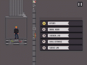
Work in Progress : Elevator to switch between rooms
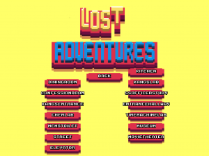
I have a lot of rooms (about 10 rooms for each Act) There will be around 40 in total. I need to be able to switch really quick to test them. It’s a typical smorgasbord of buttons to do just that. Such a ‘switch’ screen will not be in the game because that would break the immersion of the game.
I really wanted to make this ‘real’ transition room quickly, because it can be part of the game. It is a shown in a special way because it is projected from the side completely. The only thing Dave can do is press the buttons. Depending on the floor the speed of the transition is faster when the floor destination is farther from the current floor. Lang’s building is very futuristic, so such a turbo lift could be expected. The elevator is what I expected too be, I had made the art in pieces long before I made the movement so It was really coding all the movement. A lua script is driving the animation as all the other rooms.
Still, this is all not set in stone because I am not convinced the player should see the buttons all the time. I could centre the buttons when the player activates the panel and show some stuff buried in the concrete. The elevator created a new puzzle for the adventure, getting an elevator pass…  The elevator above is an animated gif so click the preview thumbnail to look at it. It’s quite hypnotic…!
Animated Gif of the Angry Guard and status development
In anticipation of the animation function in Pixaki I discovered that the updated Pixely app has an animation function that can export to gif. I added the frames of the angry guard character (a small character in The Lost Adventures) and create an animated gif.

It really looks if he is about to beat you up!
The Lost Adventures engine is almost feature complete and I am about to leave pre-production. There will probably missing some features, but they are not necessary for the main story and adventure gameplay.
The adventure engine has the following features :
- Voice acting support in dialogs
- Animation system controlled by Lua scripting
- Game state saving (no saving interface yet!)
- Follow and zoomcamera controllable with scripting
- Dialog tree support
- Scripted background music and sound
- Inventory management
- A star path finding for tilemaps
- All kinds of scripting events , wait, walk to, move to etc..
- System describing stuff in the world including voice support
Wish list :
- Save interface
- Loading screen
- Character animation for seperate parts, mouth and arm gestures
Created font rendering node for the dialogs
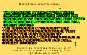
I had some serious trouble with my arcade true type font. Because ttf only have one color, I pondered about pre rendered fonts on a bitmap sprite sheet.
Initially I liked this idea, but I like the true type font because it’s quick and resizes really nicely. But the problem is that If I wanted multicolour characters this won’t do. So what did I do? Well, I made two CCLabelTTF nodes and drew them over each other. One node as an outline and one for the fill. This worked very well, except for multiple lines…. The truetype font node shifted a pixel or so on each row. This is because of the rounding errors in the “how many text can fit in a certain box” calculation in the True Type rendering. Look at the green coloured arcade text. Its the TTF version. Some of the characters are smeared across each other and that sucks big time. So what to do then? Wrestle with bitmaps and aliasing again? No not again!
The orange coloured is drawn block for block by Cocos2D primitives rendered on a texture. A sprite for each character is created from those textures. But with this new approach I had to create the “how many text can fit in a certain box” algorithm for my solution too. Plus all the font input had to be made too, so it took me about 6 hours to make this. But this is a very important aspect of the game, so it deserves the quality it has now. On the plus side I can make lowercase characters, making the game even more authentic to the likes of Indiana Jones and the Fate of Atlantis. Another plus is memory consumption, my solution uses less memory than the TTF one. Another plus is that I also aligned every line of text in the dialogs, just because I was on it anyway.
The Lost Gamestate…
Persisting state of things in an adventure is a really hard thing to crack. Is it coincidence that persisting and resisting sound the same?
I waited some time to implement this because I needed to find out first how the bridging between the Objective C and the Lua code sorted out. Maybe I needed to store the state in anoyher way? And I didn’t had any experience with a dynamic language like Lua. But as I gained more experience with Lua I thought I was ready to implement the save games routines.
But still… The choices you have to make are pretty hard because design mistakes like this will hunt you throughout the development of the game. I looked at various adventure projects currently in development and tried to find out how they had solved this or how they will solve this problem. Some of them solved this by serializing the state if the objects as they were loaded in memory. This is very commonly used in managed languages as Java and C#. In fact,every serious programming language has it’s own way of storing this. Objective C uses NSCoding to make the objects persist-able. I used this technique on earlier games I made but I hated the hard labour you had to put into it. You have to explicitly tell the system what to serialize and not to serialize. And with a complex hierarchy like adventure objects it can become a mess. So I tried to avoid this entirely.
I started this project with Objective C for the graphics and heavy lifting. Lua (a great embedded language)  is used to write the behaviour of my game and manages all the state present in the adventure.
My first thought was storing each Lua call like versioning systems do. Every time something happens the Lua call will be stored and when the game needs reloading all Lua calls will be executed in the order they were executed before. The big problem with this is that the entire history of calls are getting longer and it can hurt performance in the long run.
The savegames in this scenario will mark several branching points.
This could be a viable solution but besides the pros there are a lot of cons
Pros:
- Only one big Lua State to manage
- Very accurate tracking of every possible state in the game
- Not much coding to do except loading and replaying
Cons:
- Increasing loading and execution time before starting room
- Need to store the lua call immediately in memory or database
- Stores stuff that might not be necessary to be stored.
Most of the solutions I encountered were storing the state of a subset of the Lua objects at specific intervals. This seemed a better approach to me as I had already chosen to make one Lua script per room. Lua fetches all object states when the room is entered and if it’s not present a template will be set.
Right now I can differentiate between 4Â kinds of state objects:
- RoomState : Stores all the stuff that happens in the room the player is in.
- PlayerState :Â The player (Playable Character) moves between rooms and will be loaded beforehand (to see which room he is and will be his starting point).
- NpcState : Some Npc’s (Non Playable Characters) will and can move across different rooms, and they will be added and loaded according their currentroom property.
- GlobalState : All event data that needs to be accessible at any time. This will for example be events setting a state variabele that are triggered while having a dialog with a npc and some other dialog depends on that state
The next part of the solution is in which format I can store the lua state. That decision was easy: Json is superefficient because the way lua tables are initialized is json without quotes. I found a very basic json implementation that worked without much fuss. Look at the difference between Lua table creation and it’s Json format :
local room = {
    name="museum",
    objectElevatorDoor={
        standingLocation="{20,2}",
        buttonlocation="{21,3}"
    }
}
{
   "name":"museum",
   "objectElevatorDoor":{
      "standingLocation":"{20,2}",
      "buttonlocation":"{21,3}"
   }
}
It’s basically replacing the equal sign for an semicolon sign and wrap the props in quotes and you have the Json format basically.
I used this Basic Json parser that parses json to tables and tables to json. The only problem I had was that the parser tried to serialize the functions too.  This could lead to crashes because I could not load the function back from the database.
I wondered if I could seperate the data from the functions. And yes, this can be done really nicely with the use of Lua metatables. A metatable can be seen as an extension point when set on a table. A very good tutorial on how this works can be found here. The structure I came up looks like this:
function common.EntityFactory.createRoom(roomName)
    local room={};
    room = {
        name=roomName
    }
    return room;
end

function common.makePersistable(tableToSetMetatableOn)
    setmetatable(tableToSetMetatableOn,
        {
            __index = function(table, key)
                if key == "persist" then
                    return function()
                        jsonToPrint = json.encode(table);
                        print("LUA JSON FOR room : " .. jsonToPrint);
                        luaController.persist_room(table.name,jsonToPrint);
                    end
                end
            end
        }
    )
end
The showed function is the ability for the object to persist itself.  The luaController is a user data object that calls the Objective C method to persist the Json string.
This defined metatable with the persist function can be set on the player at any time. That way I could create some ObjectOriented approach to handle these kind of things.
common.makePersistable(currentRoom);
The last thing I needed to figure out was how to store this. I chose SSLite because this is a well supported choice on different platforms (android needs to be supported too). I made a nice wrapper for crud operations.
When a save-game is created by the player the intermediate and temporary json records are copied to a different table. It will get an additional timestamp, title and a save image that consist of a freeze frame screenshot. Well this is the plan, that part is not implemented yet. But I have to start somewhere don’t I?
Lua Scripting
I started off early with Lua scripting. This was mainly because the Ray Wenderlich RPG samples were using it and this gave me a head start and a direction. I think Lua is a beautiful scripting language, and it has real potential (see the Love2D framework).
It’s what I can teach my 9 year old son. So it’s pretty nice.
I am still in pre-production and I wanted to make coding the actor (NPC and player) actions as easy as possible. If you settle to early for something simple to progress quickly, it can be really cumbersome when you need to make a lot of changes to rooms and actors.
I made a pickup animation sequence completely in Objective C, but I knew this was wrong.
If I had to change or extends this I had to change about 40 lines of code and it wasn’t flexibal.
This was wrong because the behavior of actors is data but in the form of scripts. I have one script per room.
As you can see this is much nicer and flexible :
local seqOpen = cs.SequenceFactory.new("dave");
seqOpen.walkTo("{6,5}");
seqOpen.animationBackAndForth("pickupsideways");
seqOpen.addInventory("hammer");
seqOpen.wait("0.8");
seqOpen.script("passHammerToDave");
seqOpen.start();
This script will :
- Walk the main character to the item.
- He will kneel to pick it up and will rise again. This is a back and forth animation
- Add the item to the inventory of the player
- Wait for about a second and run a lua method called passHammerToDave that alters the state of the character. Dave will ‘own’ the item now.
Now it passes all these actions to the CCActionSequence that is supported by the Cocos2D framework. The seqOpen will be passed as an array of commands to the Objective C bridging code, and this will execute this in sequence as CCAction’s! Many actions in cocos2d are finite time actions, that means that walking to a certain tile with the help of an A* (Astar) algorithm does not fit easily into an action. So I splitted all separate CCAction sequences and let every sequence end with an action to fire an event to a sort of action manager class that starts the next sequence.
This looks like this :
    NSMutableArray *preppedActions = [NSMutableArray array];

    for (NSString * scriptingLine in luaStringTableArray) {
        if ([scriptingLine hasPrefix:@"walkto"]) {
            id blockToExecute = [CCActionCallBlock actionWithBlock:^{
                CCLOG(@"scripted walkto reported");

                NSString * coords = [LuaUtility firstArgFromScriptLine:scriptingLine];
                player.moving = YES;
                [player moveTowardsTileCoordWithAi:CGPointFromString(coords)];
            }];
            [preppedActions addObject:blockToExecute];
        }else if([scriptingLine hasPrefix:@"wait"]){
            NSString *delay = [LuaUtility firstArgFromScriptLine:scriptingLine];
            CCTime timedDelay = [delay floatValue];
            id actionDelay = [CCActionDelay actionWithDuration:timedDelay];
            id blockToFireEvent = [CCActionCallBlock actionWithBlock:^{
                [player.characterAnimationManager eventReportedOn:player event:@"waiting finished"];
            }];

            id sequenceToExecute = [CCActionSequence actionOne:actionDelay two:blockToFireEvent];
            [preppedActions addObject:sequenceToExecute];
        }
        else if([scriptingLine hasPrefix:@"animate"]){
            NSString *animationName = [LuaUtility firstArgFromScriptLine:scriptingLine];

            id blockToStartAnimation;
            if([scriptingLine hasPrefix:@"animateonce"]){
                blockToStartAnimation = [CCActionCallBlock actionWithBlock:^{
                    [player startOneTimeAnimation:animationName];
                }];
            }else if ([scriptingLine hasPrefix:@"animatebackandforth"]){
                blockToStartAnimation = [CCActionCallBlock actionWithBlock:^{
                    [player startBackAndForthAnimation:animationName];
                }];
            }

            if(blockToStartAnimation){
                CGFloat animationDuration = [player animationDuration:animationName];
                id delayFromPickingUpAnimation = [CCActionDelay actionWithDuration:animationDuration];
                id blockToFireEvent = [CCActionCallBlock actionWithBlock:^{
                    [player.characterAnimationManager eventReportedOn:player event:@"animation finished"];
                }];

                id sequenceToExecute = [CCActionSequence actions:blockToStartAnimation,delayFromPickingUpAnimation, blockToFireEvent,nil];
                [preppedActions addObject:sequenceToExecute];
            } else{
                CCLOG(@"WARN : syntax of the animate command was not correct, it needs to be animateonce or animatebackandforth it was %@",scriptingLine);
            }

        }else if([scriptingLine hasPrefix:@"script"]){
            id blockToExecute = [CCActionCallBlock actionWithBlock:^{
                [luaScriptProcessor runVoidScript:[LuaUtility firstArgFromScriptLine:scriptingLine]];
            }];
            id blockToFireEvent = [CCActionCallBlock actionWithBlock:^{
                [player.characterAnimationManager eventReportedOn:player event:@"script finished"];
            }];
            id sequenceToExecute = [CCActionSequence actionOne:blockToExecute two:blockToFireEvent];
            [preppedActions addObject:sequenceToExecute];
        } else if([scriptingLine hasPrefix:@"move"]){
            id moveAnInch = [CCActionMoveBy actionWithDuration:0.2f position:CGPointMake(20,0)];
            id blockToFireEvent = [CCActionCallBlock actionWithBlock:^{
                [player.characterAnimationManager eventReportedOn:player event:@"script finished"];
            }];
            id sequenceToExecute = [CCActionSequence actionOne:moveAnInch two:blockToFireEvent];
            [preppedActions addObject:sequenceToExecute];
        }  else if([scriptingLine hasPrefix:@"playsound"]){
            id blockToPlaySound = [CCActionCallBlock actionWithBlock:^{
                [[AudioManager sharedManager] playSoundEffect:[LuaUtility firstArgFromScriptLine:scriptingLine]];
            }];
            id blockToFireEvent = [CCActionCallBlock actionWithBlock:^{
                [player.characterAnimationManager eventReportedOn:player event:@"script finished"];
            }];

            id sequenceToExecute = [CCActionSequence actionOne:blockToPlaySound two:blockToFireEvent];
            [preppedActions addObject:sequenceToExecute];
        }
        else if([scriptingLine hasPrefix:@"addinventory"]){
            id blockToAddInventory = [CCActionCallBlock actionWithBlock:^{
                NSString *sceneItemName = [LuaUtility firstArgFromScriptLine:scriptingLine];
                [[InventoryManager sharedManager] addInventoryItemByName:sceneItemName];
                [tilemapTool removeObjectFromMap:sceneItemName];
            }];
            id blockToFireEvent = [CCActionCallBlock actionWithBlock:^{
                [player.characterAnimationManager eventReportedOn:player event:@"script finished"];
            }];

            id sequenceToExecute = [CCActionSequence actionOne:blockToAddInventory two:blockToFireEvent];
            [preppedActions addObject:sequenceToExecute];
        }


        else if([scriptingLine hasPrefix:@"gotoscene"]){
            id blockToGotoScene = [CCActionCallBlock actionWithBlock:^{
                //TODO Pass specific roomid in case of roomchange
                NSString *roomId = [LuaUtility firstArgFromScriptLine:scriptingLine];
                SwitchRoomScreen *scene = [[SwitchRoomScreen alloc] init];
                [[CCDirector sharedDirector] pushScene:scene];
            }];
            [preppedActions addObject:blockToGotoScene];
        } else if([scriptingLine hasPrefix:@"tileon"]){
            id blockToPutTileOn = [CCActionCallBlock actionWithBlock:^{
                NSString *tileCoords = [LuaUtility firstArgFromScriptLine:scriptingLine];
                CCTiledMapLayer *wallLayer = [tilemapTool.tileMap layerNamed:@"collisiontiles"];
                [wallLayer setTileGID:1 at:CGPointFromString(tileCoords)];
            }];
            id blockToFireEvent = [CCActionCallBlock actionWithBlock:^{
                [player.characterAnimationManager eventReportedOn:player event:@"script finished"];
            }];
            id sequenceToExecute = [CCActionSequence actionOne:blockToPutTileOn two:blockToFireEvent];
            [preppedActions addObject:sequenceToExecute];
        } else if([scriptingLine hasPrefix:@"tileoff"]){
            id blockToPutTileOn = [CCActionCallBlock actionWithBlock:^{
                NSString *tileCoords = [LuaUtility firstArgFromScriptLine:scriptingLine];
                CCTiledMapLayer *wallLayer = [tilemapTool.tileMap layerNamed:@"collisiontiles"];
                [wallLayer setTileGID:0 at:CGPointFromString(tileCoords)];
            }];
            id blockToFireEvent = [CCActionCallBlock actionWithBlock:^{
                [player.characterAnimationManager eventReportedOn:player event:@"script finished"];
            }];
            id sequenceToExecute = [CCActionSequence actionOne:blockToPutTileOn two:blockToFireEvent];
            [preppedActions addObject:sequenceToExecute];
        }
    }

    [player.characterAnimationManager loadActionsFromArray:preppedActions];
    [player.characterAnimationManager startAnimations:player];
    player.characterAnimationManager.continuous = continuous;
A lot of code, for sure. But this is what I need to do once… Maybe the code needs some cleaning up, but for now it’s ok. It does the job well. Every action will be perfectly in sequence because each action will fire an event to the characterAnimationManager to signal that the next sequence should be executed.
The next scripts will show the scripting for opening the elevator door and going to another room :
local seqOpen = cs.SequenceFactory.new("dave");
sequence.walkTo(room.objectElevatorDoor.buttonlocation);
sequence.animationOnce("reachcentre");
sequence.playSound("button.caf");
sequence.wait("0.2");
sequence.playSound("slidedoors.caf");
sequence.switchCollision(room.objectElevatorDoor.standingLocation, "off");
sequence.script("openElevatorDoor");
The script does the following steps:
- The player walks to the button location that is defined in the room he is in.
- The player will reach for the button when it uses the verb “use” on the control panel
- Button sound plays (this is alway an asynchronous event)
- The sound for sliding the elevator is played
- The elevator has some tile locations that needs to be blocked or unblocked when doors close or open up.
- The sequence runs the open elevator door animations that is called via lua via function ‘openElevatorDoor’
Well lets see these both scripts in action! (trust me… it’s quite short) :
App Icon Evolution
Is it too early to look at an icon? I think you need to start early, trying different designs and get into grips with a certain look… It’s these kind of things that, if you wait too long for it to make and when you are trying to finish the game, you will not make a proper icon. Those final crunch days are gruesome because bugs need to be squashed, menu’s have to be made, a settings screen you forgot and maybe the gameplay still lacks some finesse? Eventually  you will not have the time to make it anyway!
One other thing is that you need to know how long your icon could last. Does it bore you? Does it grow on you? Does it stand out? I am on to my third icon now, and it could be the final one.
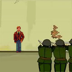
The icon below was a really early icon I created just to try to lay out the composition and to get off the default Spritebuilder icon, Dave was standing against the wall ready to be fusilladed by german WWII soldiers. I you think this looks familiar, it is! Because a part of the cartoon is actually stolen from the political cartoon for the Peking Olympics
The idea was that Dave would transported back to the present day with a kind of transporter beam. I knew this was only a working icon and I would make a complete overhaul of it. But the transporter thingy, stuck with me though!
A long period after that I thought that the Time Machine had a shape that could be fitted into an icon. So I made a Hires character and put that in the time machine. This was a first draft and the dave character was not recognizable on small icons. The colors were completely off and it did not have the pixelated look I was looking for.
So I came up with this icon. I still use it today. The character is the Dave character as he will walk around in the game. The colours are bright and playful. The transporter twinkling stars makes it as if Dave is actually being transported back in time! Maybe I should tweak the shadowing a bit?
Well, that’s it for now!
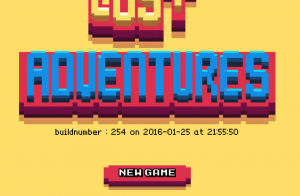
Created a build number script to The Lost Adventures title screen
I was sick of guessing how recent the installed version of The Lost Adventures was on my iDevices. So I made an Xcode pre-build script that writes the Git commit number plus a date/time  to a simple txt file.
This is picked up and shown on the main title screen.
I thought I did more commits last year… But maybe I didn’t commit at the start of the project…? That could be… Vacation….? Anyway, nice…!

