It is fun to see how I thought about asset creation before I started.  I made a lot of stuff with 3D Studio Max and Blender for earlier games. A lot of the assets for Blooneycounter were made with the help of Blender. So it was logical to make some of the stuff with those tools. I knew that animations were hard to do and I though I could make a pixelartsy look with the right shaders. I never made any animations so I didn’t know how to do that.
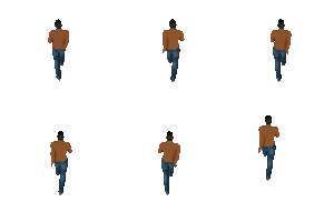
I made a character that had a good bone setup with the MakeHuman tool. This is completely free and you can tweak the model before exporting. I picked up some nice walking animations from Carnegie Mellon University site. And after some time you have a walking figure. Exporting the frames gave the following animated character:
The good thing about modeling is that you can render it from any angle for free :
 But the thing is…. It looks crap… And even how I tried my best. It looks darkish, awkward and everybody knows it was a 3D model.
So I decided to ditch the Blender way of doing stuff, and decided to hand animate frame by frame. And although making frames this way is sometimes time-consuming, it looks bright, nice and pixelated. Above animations are rendered at 60FPS… way to much for pixel art. Usually any animation has about 9 frames. My characters are 70×150 and it’s very doable.
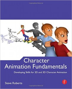
I bought character animation fundamentals to help me understand posing and acting characters
My animations are improving steadily and I love how it looks. I created a falling animation in less than 4 hours, and that’s okay. I plan to make about 20 animations for the first level. I already created about 12, so still 8 to go.
These are the ones left (for the first level):
- Putting up glasses
- Throwing a flashing grenade
- Dog animation
- Hand animations (no spoilers)
- Reach high animation
- Reach low animation
- Sit and eat animation
- Vaporize animation